Color does more than decorate—it communicates. From a signature green to the warm earth tones of boutique hotels, color anchors brand perception and guides spatial experience. Understanding the branding power of color is no longer optional—it’s strategic.
Color shapes how people feel, behave, and connect with their environment. In architecture, this psychological dimension becomes a subtle but powerful design tool. A deep blue can project trust and stability, often favored in financial or governmental buildings, while bold reds and oranges inject urgency or vibrancy into retail and entertainment spaces. Yet the language of color is never universal—cultural context, lighting conditions, and surrounding materials all influence perception.
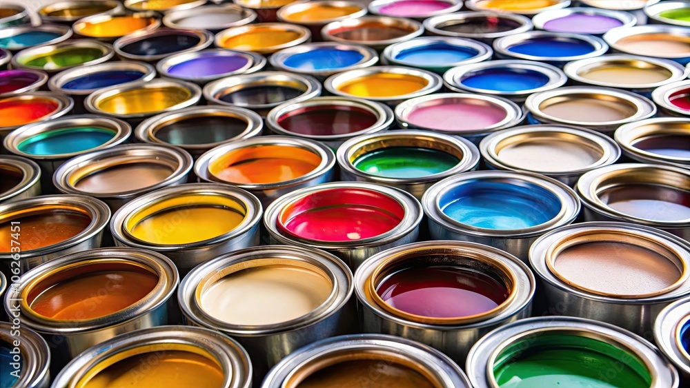
Color isn’t just visual—it’s emotional. The right hue can amplify brand recognition, enhance user experience, and give architecture a voice. As branding moves beyond the logo, color should take center stage in the design dialogue.
Here’s a quick guide to how colors are commonly associated with emotions in Western culture:
Red: Passion, excitement, urgency, or even anger. It grabs attention and can raise energy levels.
Blue: Trust, peace, and stability. It’s often used in corporate branding for its calming and dependable vibe.
Orange: Enthusiasm, creativity, and warmth. It’s often seen as friendly and energetic.
Yellow: Optimism, happiness, and clarity. But in excess, it can also trigger anxiety or frustration.
Green: Balance, growth, and calm. It’s strongly tied to nature and can evoke feelings of renewal.
Black: Power, sophistication, or mourning. It’s bold and timeless, but also somber.
For architects and specifiers, understanding these nuances isn’t just an academic exercise, it’s essential to aligning physical design with a client’s brand story and user experience goals. For a company, a powerful use of color on their building’s exterior can elevate visibility, reinforce brand recognition, and create a lasting emotional connection with users.
Understanding that color has the power to elevate architecture, transforming simple structures into striking landmarks, leads to a final question. What coating should you use? To preserve that visual impact, color retention is key. A coating must hold its original vibrancy over time, despite exposure to sun, rain, and pollution. Lesser coatings can quickly fade, chalk, or discolor, leaving buildings looking worn and poorly maintained. That not only diminishes curb appeal but can also undercut brand perception and property value. In contrast, high-performance, color-stable fluoropolymer coatings are engineered with advanced pigments and PVDF binders to resist environmental damage. The result? A vivid, lasting finish that keeps your building looking its best year after year.
Our line of advanced fluoropolymer coatings, formulated with Kynar Aquatec® technology, delivers exceptional long-term durability and color retention—even under the most punishing environmental conditions. These high-performance water-based coatings resist chalking, fading, and weathering, making them ideal for architectural applications where brand integrity and visual appeal are critical.
Whether it’s capturing the bold energy of Phillies Red or reflecting the community-driven ethos of M&T Bank green, our coatings empower organizations to express their identity with confidence. By combining robust performance with vivid, lasting color, we help our clients turn their buildings into living brand statements.
Finally, GO PHILS!